Welcome to The Hand Lettering Forum!
This is an interactive Bulletin Board on the topics of Sign making, design, fabrication, History, old Books and of coarse Letterheads, Keepers of the craft. The Hand Lettering Forum features links to resources, sign art history, techniques, and artists profiles. Learn more about Letterheads at https://theletterheads.com. Below you'll see Mchat has been added as a live communication portal for trial, and the Main forum Links are listed below.

Milk Wagon, San Francisco, 1800's

Hand Lettering topics: Sign Making, Design, Fabrication, Letterheads, Sign Books.

Moderators: Ron Percell, Mike Jackson, Danny Baronian

Post Reply
Danny Baronian
Site Admin
Posts: 638
Joined: Wed Apr 07, 2004 2:16 am
Contact:

Milk Wagon, San Francisco, 1800's

Post by Danny Baronian »

Here's a scan of a photo from a glass negative. I have no information on it other than the wagon was used to deliver milk in San Francisco.

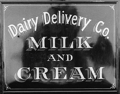
Whoever did the paint job knew what they were doing!


Image


Image
Last edited by Danny Baronian on Fri May 06, 2005 2:53 am, edited 2 times in total.
Danny Baronian
Baronian Mfg.
CNC Routing & Fabrication
http://www.baronian.com
Roderick Treece
Posts: 1086
Joined: Sat Apr 10, 2004 8:04 pm
Location: San deigo Calif
Contact:

Post by Roderick Treece »

Danny,
I think it must have been done by Larry Whites great grand father.Isn't that where he learned how to do his famous double drop shadow?

Roderick
Doug Fielder
Posts: 143
Joined: Thu Jul 22, 2004 7:08 pm
Location: Port St Lucie, FL
Contact:

Post by Doug Fielder »

Thanks for sharing those beautiful pictures, I love to go to the Shelburne Museum here in VT to look at all the old coaches, carriages and sleighs. Absolutely fabulous lettering and stripe work on them. There are even a couple of butcher wagons and even a police paddy wagon? If I can get pictures, I will post them here. All the barns where they are kept are dark and they don't like flash photography. So, if anyone does come up or out here, it is well worth the admission fees.
Doug F.
FALLOUT Grafix
Port St Lucie, FL

Formerly from NJ, Formerly from VT,
Formerly from SF, CA, Formerly from NC,
Formerly from CO, FINALLY settled in FL!
Guest

Post by Guest »

Doug Fielder wrote:Thanks for sharing those beautiful pictures, I love to go to the Shelburne Museum here in VT to look at all the old coaches, carriages and sleighs. Absolutely fabulous lettering and stripe work on them. There are even a couple of butcher wagons and even a police paddy wagon? If I can get pictures, I will post them here. All the barns where they are kept are dark and they don't like flash photography. So, if anyone does come up or out here, it is well worth the admission fees.
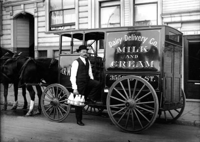
Doug, do you have Photoshop? I think everybody knows about the levels feature, but it was fairly recently that I discovered how to use it without making the photo too dark or too washed out. I've always slid the right arrow(lightness) to the left and the left arrow (darkness) to the right. But, it turns out that it's that center arrow (midtones) that can bring detail out of the shadows with a fair amount of detail.

Hope this helps on the flashless pics. If you already knew this, maybe it will help someone else.
oatis
Posts: 66
Joined: Sun Jun 27, 2004 12:33 am

Post by oatis »

Danny: A great contibution, And a terrific reminder: When we examine steetscape photos like these (especially pertinent to those of us interested in studying--and emulating--period design) we notice plank after window after awning after wall covered well-executed legibly-spaced PLAIN LETTERING! The occasional full-tilt oddity shows up, but the best route to an appreciation and mastery of TRUE period-appearing design comes through the discipline of basic journeyman signpainting.

Every time I get a commission for an antique-style project, I've got to beat most of the flourishes back with a stick, limit the eccentric characters to a few well-placed accents, and admit that even the sexiest Rawson and Evans panels are usually very plain. The path to authenticity is in an attention to the subtle.

I'd like to see more Letterheads projects rendered with just this degree of restraint.

Thanks again!

Oatis
Mike Jackson
Site Admin
Posts: 1705
Joined: Tue Apr 06, 2004 11:02 pm
Location: Jackson Hole, WY
Contact:

Post by Mike Jackson »

Image

http://www.theletterheads.com/lhparts/halsted.html

Hey Mark,
Are you going through a new "phase"? :) Less is more? I have to chuckle now as I read your comments, all the time thinking about the Clarkson project from a long time ago. You loaded that one up!

Besides the simple, well executed signs like the one above, I also enjoy viewing the more complicated ones. I especially like the projects that look simple and read well from a distance, but have fine detailing and subtle blends, not immediately visible from a long distance—or at first glance. Quite a few of the original Letterheads were very good at that. In fact, that seems to be what got you noticed originally!

Signs similar to Danny's example, obviously executed by a skilled journeyman, were still common and somewhat boring at the time the Denver group entered those first contests. Since we don't see examples of this kind of basic craftsmanship much anymore, it is now eyecatching and refreshing again.

The image above is just one of several from the Halsted photos on the linked page. Halsted followed on the heels of Atkinson and Strong with a very distinctive style. He was able to distill something complex into something relatively simple and clean.

Image
http://www.theletterheads.com/lhparts/parrish.html

I hope everyone takes the time to visit the other feature pages on our site. The photo above was done by Steven Parrish. Most of his work shared a similar Spartan simplicity—masterfully executed, legible, and well spaced.

Mike Jackson
Mike Jackson / co-administrator
Golden Era Studios
Vintage Ornamental Clip art
Jackson Hole, WY

Photography site:
Teton Images
Jackson Hole photography blog:
Best of the Tetons
Dan Seese
Posts: 324
Joined: Tue Apr 13, 2004 11:29 pm
Location: Fort Collins, CO
Contact:

Post by Dan Seese »

I never had the benefit of going through an apprenticeship but in the early 70's when I was learning to paint signs there was a gentleman who helped me with the basics of lettering, gave me my first quill (used) and would always give me advice on layout, letter spacing and critique my feeble attempts at basic sign making. Harold Asmus had begun painting signs in 1934 and was still at it when he died a few years ago.
I still see his signs around Fort Collins and always stop when I can to photograph them when I see them. His style was recognizable and you normally didn't see anything real "tricked-out" with the stuff we do at Letterhead meets. But the thing that was so stellar about his work was that everything WORKED. Not only was he incredibly fast, but all of his layouts were tight, legible, pleasing and appropriate solutions for his clients.
A true sign maker, it seems, is one who neither is neither stuck in Atkinson-style gingerbread nostolgia nor content with applying computer cut "Times Roman" vinyl for every job. He/she considers what is appropriate for the client's needs and does his best to come up with an appropriate solution at a reasonable price. That is an integral element of the craft. The subtle features that quietly go about the business of communicating what the sign is supposed to say are sometimes more difficult for me to execute because I have to keep slapping my hand and remember that the subliminal message of every sign isn't necessarily supposed to be, "Hey, guys, look what I can do!"

Dan Seese
Mike Jackson
Site Admin
Posts: 1705
Joined: Tue Apr 06, 2004 11:02 pm
Location: Jackson Hole, WY
Contact:

Post by Mike Jackson »

Hi Dan,
I can take your perspective and twist it a bit to highlight another point. We live in a tourist town through which two to three million visitors pass each year. A very large chunk of that number is only in town one day—some only a few hours.

Knowing that, when we used to have our regular shop, we presented our potential clients with the passing tourist concept. They should know it already, of course, but many never thought about it. I would say, "You know, if I had an old time photo parlor (substitute business type) in this town, I'd want MY business to appear to be the BEST one of the photo parlor group. Your clients only have a few hours in town and must make decisions about a business from oustide. The signs, along with the exterior decor, can either draw people in or push them away.

So, from my local perspective, the scenario isn't based on another feather in MY hat for getting to do a "fancy" sign, but more that we were helping make their signs stand out. For most of the years we sold the commercial signs, the town motto was "The Last and the Best of the Old West", so naturally we used that to influence the type of signs and style of layouts we did.

This August, it will have been 10 full years since we sold Jackson Signs. That was a good call for us at the time, but I do sometimes wonder what our signs would like now and what the town would look like if we hadn't sold. I know we would have evolved our style as necessary. Unfortunately, Jackson Hole is now be homoginized a bit by the national chains and corporate logos, pushing many of the old mom and pop shops out of the quaint little picture.

I do agree with you on several points. The end goal is to taylor a project around the client's "needs" (and budget). Those needs vary greatly based on localle, business types, distances, and a long list of other variables.

Mike Jackson
Mike Jackson / co-administrator
Golden Era Studios
Vintage Ornamental Clip art
Jackson Hole, WY

Photography site:
Teton Images
Jackson Hole photography blog:
Best of the Tetons
Post Reply