I am wanting to do a blend using asphaltum. This would be in the matte center part of bright oulined letters.The top of the letter would be the darker part and would gradiate to just the oil size. I thought of applying the asphaltum half way down or so, letting dry, and then gently removing where needed with thinner on cotton or a soft rag to acheive my gradient. Then size the whole center and gild.
Or, mixing asphaltum in the oil size as needed and blend as I go to create the gradient, then gild when the size is ready.
Which one of these two methods would be the best? Or neither? Is there a better method to acheive what I want? I would think the first method so I could size all my letters at once. The time it takes to blend each letter while wet would not let me get through as quickly. I know, do a test peice, and I plan on it. But, how would you do this?
Thanks, Jerry
Welcome to The Hand Lettering Forum!
This is an interactive Bulletin Board on the topics of Sign making, design, fabrication, History, old Books and of coarse Letterheads, Keepers of the craft. The Hand Lettering Forum features links to resources, sign art history, techniques, and artists profiles. Learn more about Letterheads at https://theletterheads.com. Below you'll see Mchat has been added as a live communication portal for trial, and the Main forum Links are listed below.
This is an interactive Bulletin Board on the topics of Sign making, design, fabrication, History, old Books and of coarse Letterheads, Keepers of the craft. The Hand Lettering Forum features links to resources, sign art history, techniques, and artists profiles. Learn more about Letterheads at https://theletterheads.com. Below you'll see Mchat has been added as a live communication portal for trial, and the Main forum Links are listed below.
Blending
Moderators: Ron Percell, Mike Jackson, Danny Baronian
-
Billy Pickett
- Posts: 118
- Joined: Mon Aug 02, 2004 11:59 am
http://www.theletterheads.com/signphoto ... ickett.jpg
...Jerry, (rather than asphaltum) I use One Shot tinting black. I mix a very tiny bit it w. OS quick dry size, thin it good, strain and spray gradients w. an air brush. This doesn't require much black, in fact what may look light before it's gilded, can be darker (than you want) after. Spraying gives beautiful blends but requires either good masking and or some clean up after. You can also dab the mix in w. a brush, and then blend it out w. a dry fitch. Brush mottling can also give a nice rough textured look too. Let this colored size dry well, resize again, and gild as usual. Other than black, there are transparent (red, blue, green) enamel and oil paint colors such as pthalo and prussian green, prussian blue, brunt sienna, raw umber etc. that work and look great.
...And the ONLY way to predict the results of this technique is to make test panels...
-
Kelly Thorson
- Posts: 502
- Joined: Tue Apr 20, 2004 11:53 pm
- Location: Penzance, SK Canada
- Contact:
I've found that the size will soften the asphaltum and cause it to move if you work it at all, so you would have to be very careful not to overwork it, unless you have a barrier like shellac between them. I have placed the size and stippled asphaltum into it with a stencil brush for a nice textured effect or your idea of blending as you go would probably work.
In my opinion, 1-shot can't come close to touching the warmth of asphaltum with gold. One of my all time favourite effects was created by doing a very thin glaze of asphaltum thinned with mineral spirits over the glass, distressed with some drops of mineral spirits and sponge lifted areas and then water gilded afterwards. It hangs with all the other glass pieces in my shop and commands center stage in terms of brilliance and depth, especially in the late afternoon light.
In my opinion, 1-shot can't come close to touching the warmth of asphaltum with gold. One of my all time favourite effects was created by doing a very thin glaze of asphaltum thinned with mineral spirits over the glass, distressed with some drops of mineral spirits and sponge lifted areas and then water gilded afterwards. It hangs with all the other glass pieces in my shop and commands center stage in terms of brilliance and depth, especially in the late afternoon light.
I believe there is no shame in failure. Rather, the shame lies in the loss of all the things that might have been, but for the fear of failure.
-
Larry White
- Posts: 1213
- Joined: Thu Apr 08, 2004 4:18 am
Jerry-
Keep in mind, if you do use Asphaltum, you need to mix it with some varnish so it won't reactivate when you brush your oil size over it. I too, like airbrushing, which gives the smoothes gradient, but you have to deal with masking. If the piece has a solid color background, that can be applied first to act as the mask, leaving just those letter centers open. Then the whole thing can be airbrushed in one pass, then block in a color or gild the whole area. It can also be brushed in, which give a more antique look to it. I described a technique on a tinted drop shadow, but the same technique could be applied to a letter center. The glaze needs to be truly transparent. I like to use Black Fibroseal in varnish or clear Fibroseal. I haven't used the OneShot tinting black. It should work fine provided it is transparent. Mixing an opaque color into a clear won't yield a true transparent quality which is needed for the desired result. Transparent artist oil colors can be used, or the transparent screen inks. This brush applied tinting can be found about halfway down in this post:
Signmaking 101: Blended Letter Shades
Hi Kelly!
-
Jerry Berg
- Posts: 369
- Joined: Wed May 02, 2007 3:17 pm
- Location: pacific northwest
Thanks Billy Bob and Kelly for the responses. I have some time to finish this during the holidays and only have the asphaltum for blending at this time. I've seen blended asphaltum and really liked the look. I guess I'll be blending it as I go. I've done some practice blending and it took a while to get it just right, I am a perfectionist and wanted a very smooth gradient. Learning from my own experience I like to keep things as clean as possible with as little clean up as possible so as not to disturb what has allready been completed. Airbrushing would mean overspray clean up everywhere, that stuff travels at even the most carefull and delicate of applications. I figured the size might soften the asphaltum Kelly. I guess the easy way out method won't be the best. This will take longer but will arrive at the desired results.
I would say at the top of my list of things I'd like to learn is blending techniques. I scrape by and can fool the unlearned, but when I see some of blending done on here I just sigh.
Thanks, Jerry
I would say at the top of my list of things I'd like to learn is blending techniques. I scrape by and can fool the unlearned, but when I see some of blending done on here I just sigh.
Thanks, Jerry
-
Jerry Berg
- Posts: 369
- Joined: Wed May 02, 2007 3:17 pm
- Location: pacific northwest
-
Mike Jackson
- Site Admin
- Posts: 1705
- Joined: Tue Apr 06, 2004 11:02 pm
- Location: Jackson Hole, WY
- Contact:
Jerry,
You can also use artist oil colors mixed in with size or varnish. You can buy them in tubes at any art supply store. Burnt Umber would probably be a close match for asphaltum, but any of the other colors would also work based on the effect you wanted to achieve.
If you study Larry's step by step projects, I think you will see he has a "battle plan" mapped out in his head of the steps and techniques he is going to use. So, if one of the effects is a blended matte center, one of the best ways to apply it is with an airbrush. Knowing that, you'd save that step to the very last, when the only clear part of the glass remaining is the opening where the blend will be. It is easy to airbrush the tinted size over a solid layer of clear size, then gild when ready and back up.
You could also approach the project from the other direction and apply a mask down on the entire design, open areas for the blend and airbrush the tinted size, then peel areas for additional paint as needed and work until all the mask is gone.
If you have screen printing capabilities, you can also screen a blend of varnish into a specific area.
If you don't develop the original battle plan, you can paint yourself into a corner where getting a special effect is much more difficult to do.
Good luck!
Mike Jackson
Mike Jackson / co-administrator
Golden Era Studios
Vintage Ornamental Clip art
Jackson Hole, WY
Photography site:
Teton Images
Jackson Hole photography blog:
Best of the Tetons
Golden Era Studios
Vintage Ornamental Clip art
Jackson Hole, WY
Photography site:
Teton Images
Jackson Hole photography blog:
Best of the Tetons
-
Jerry Berg
- Posts: 369
- Joined: Wed May 02, 2007 3:17 pm
- Location: pacific northwest
Thanks Mike,
I did plan this thing out for the most part. The letter shading came after though. The background is going to have some blending effects as well. Trying to work around letters I thought would be more difficult then shading inside of the letters. I did'nt mention that inside of the letters there are also areas to recieve some MOP, so I'll have to work around that. Here is a pic of part of what I have going. You can see where the MOP will be in the center parts of the scroll, two of the same on the top & bottom and a different color type in the middle.
[img][img]http://i290.photobucket.com/albums/ll27 ... GP0061.jpg[/img][/img]
-
Mike Jackson
- Site Admin
- Posts: 1705
- Joined: Tue Apr 06, 2004 11:02 pm
- Location: Jackson Hole, WY
- Contact:

Billy Pickett's Photo
Mike Jackson / co-administrator
Golden Era Studios
Vintage Ornamental Clip art
Jackson Hole, WY
Photography site:
Teton Images
Jackson Hole photography blog:
Best of the Tetons
Golden Era Studios
Vintage Ornamental Clip art
Jackson Hole, WY
Photography site:
Teton Images
Jackson Hole photography blog:
Best of the Tetons
-
Billy Pickett
- Posts: 118
- Joined: Mon Aug 02, 2004 11:59 am
-
Danny Baronian
- Site Admin
- Posts: 638
- Joined: Wed Apr 07, 2004 2:16 am
- Contact:
Jerry,
try masking with clear static cling. Cut it by hand or plotter, then lay it on the glass.
I haven't looked over Larry's photos lately, but he places a white card behind the glass to see the progress when using black fibroseal for blends. Otherwise it's not very decernable.
Next time try leaving the blends for last as suggested, it's much easier.
Danny
 Denver Chapter of the Letterheads
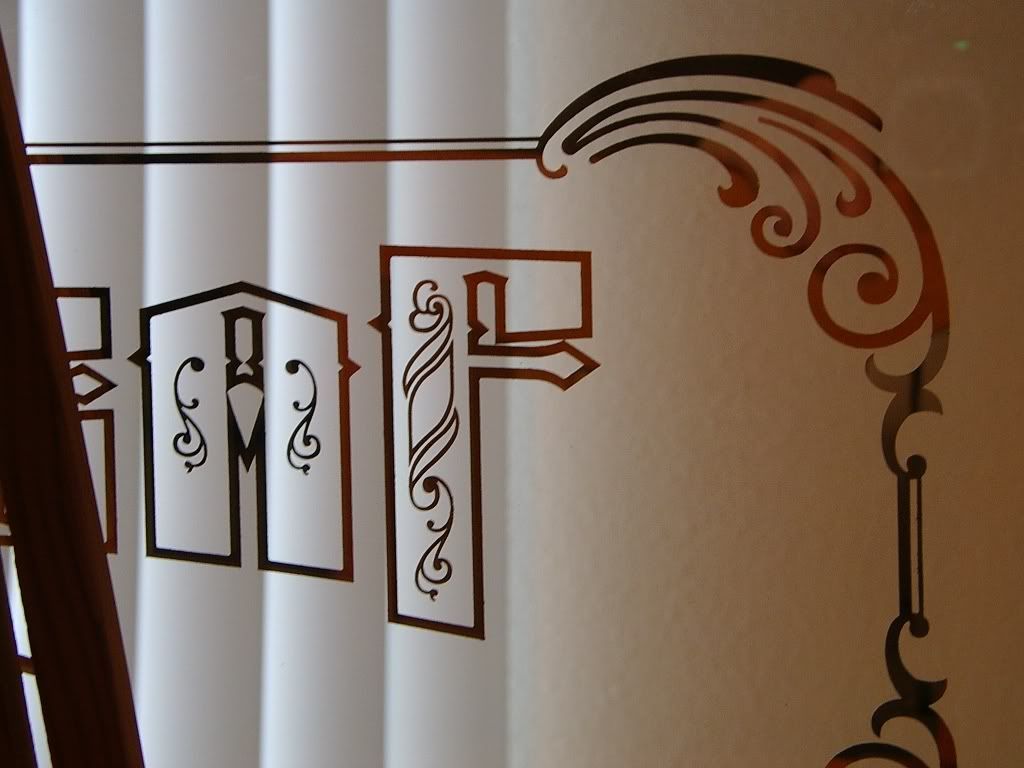