Welcome to The Hand Lettering Forum!
This is an interactive Bulletin Board on the topics of Sign making, design, fabrication, History, old Books and of coarse Letterheads, Keepers of the craft. The Hand Lettering Forum features links to resources, sign art history, techniques, and artists profiles. Learn more about Letterheads at https://theletterheads.com. Below you'll see Mchat has been added as a live communication portal for trial, and the Main forum Links are listed below.
Gold Leaf Signage
Moderators: Ron Percell, Mike Jackson, Danny Baronian
-
- Posts: 369
- Joined: Wed May 02, 2007 3:17 pm
- Location: pacific northwest
Gold Leaf Signage
Made this to put in another shop to help generate sales.
[/img][img]
The MOP actually shows up well enough, but not in the first pic. It has a 12k boarder, signage is 18k and gold leaf is 23 & 18k. It's 12"x28".
I'm also putting a sandblasted/carved & gilded sign and a pinstriped panel in the same shop as well. I'm putting pieces in a number of sign shops and a sign supply also. Part of my "sales plan" for '09.
-
- Posts: 502
- Joined: Tue Apr 20, 2004 11:53 pm
- Location: Penzance, SK Canada
- Contact:
A great sales tool / advertising piece Jerry. I really like the detailing in the letters. I've got mixed feelings about the decision on the shading on the matte portion of the lettering, while it would have looked very nice, I think sometimes the glass pieces get too ornate for the average client. I like the fact that there is a cleanliness to it that might have been somewhat diminished by the blend. It also would have made the contrast with the ornamentation uneven. But still it would have been nice.
Thumbs up
Thumbs up
I believe there is no shame in failure. Rather, the shame lies in the loss of all the things that might have been, but for the fear of failure.
-
- Posts: 1097
- Joined: Sat Feb 23, 2008 5:48 pm
- Location: Amsterdam Netherlands
- Contact:
Jerry,
I hope you have sold the example signs to your "competition" or at least made them sign a contract which exclaims that htey will be your possesion for allways and when they break they have to pay for them?
And even then I know for sure you will sell some signs through them, but they will "steal" some extra work.
Because now potential customers, interested in other 'normal' work (banners, fleetmarking etc.), think they had hit the jackpot with this crafstman who only displays your sign.
Realizing we are in the 2nd renaissance of the arts.
Learn, copy and trying to improve...
Still in the learning phase
Amsterdam Netherlands
www.ferrywinkler.nl
www.schitterend.eu
www.facebook.com/Schitterend.eu
Learn, copy and trying to improve...
Still in the learning phase
Amsterdam Netherlands
www.ferrywinkler.nl
www.schitterend.eu
www.facebook.com/Schitterend.eu
-
- Posts: 369
- Joined: Wed May 02, 2007 3:17 pm
- Location: pacific northwest
Kelly,
I did a test piece on the letter shading and decided against it. My thought was to make it a bit more simple looking to try and attract more sales. When some people see something too decorated up it could scare away a potential sale. I thought not totally simple, but not too much. I wanted to show a variety of examples in one piece. Hope it does that here. Funny thing is, this looked a lot better without the background color, just the outlined gold on the clear glass. Hmmm. Now I'm scratching my head wondering how that took away from the piece. Any ideas on this would be helpful.
Erik, I'm not aware of anyone in my area that does things by hand. I have very good relationships with most the sign shops in the area and they know what I do. When someone comes into thier shop and asks for anything hand done they give them my number. The places I'm putting things in I would'nt call my competition, but friends. They get me work that I normally might miss out on. The potential customer allways meets me to discuss the project at hand and thus knows who actually does the job. In turn, when asked who did the job it gets refered back to me. It has been working out well so far. I'm sure that it makes them look a little better in the process and that's fine with me. I don't really want to do vinyl or printing.
-
- Posts: 1213
- Joined: Thu Apr 08, 2004 4:18 am
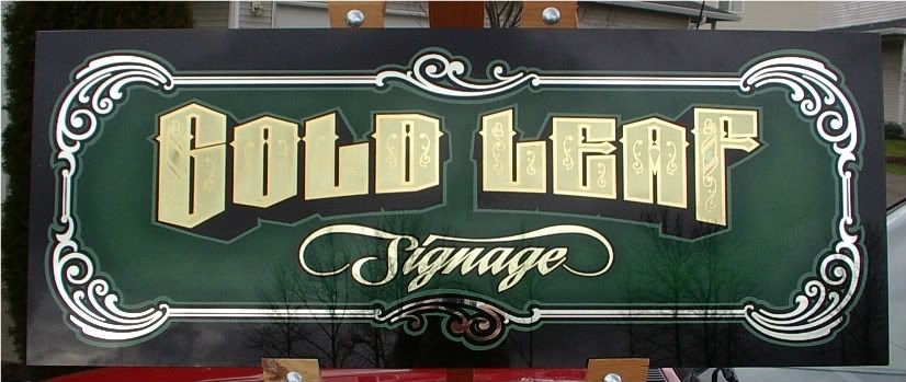
Ahhh...he's no fool, our gold leaf friend!
I'd have to agree with you Jerry, sometimes the backgrounds are the hardest part. They really can make, or break a piece. On more than one occasion, I chickened out from even painting the backgound and opted to slightly standoff the glass from a fabric covered panel. Sometimes this works quite nicely. I've taken my actual piece into the fabric store and tried it against many options. That's also a good way of visualizing a solid painted color. I've also stood the glass off of a smalt background, which adds another dimension to the piece. Mr. Dickinson introduced me to the clear static cling film, which you can carefully place over the inscription, then test various colors without actually painting them on the glass. I noticed a very large selection of different colored papers over at the scrapbooking supply store. I suppose one of each could be purchased and used to hold up behind the glass to visualize different colors. I know that feeling of painting in a background and turning it over and thinking, "huh, that sucks". Not a lot you can do at that point, although I have rescued a few.
This is a fabric background. It's stood off from the glass slightly and the shadow cast by the inscription on the fabric adds an interesting dimension.
This is also a fabric backgound. This fabric has an irridescent floral pattern which changes as you walk by.
This sign had a faux marble panel, and blended color painted background, then it was stood off a smalt background.
Here's the static cling film in use, testing colors.
Keep up the good work!
Aho!
Oh, a drop shadow on the word "signage" would've give it a little extra punch.
-
- Posts: 369
- Joined: Wed May 02, 2007 3:17 pm
- Location: pacific northwest
Thanks Larry,
Allways learning.... From the help of all the talented people here, and my own mitakes. After framing this things look much better now.
Framing really helped this one along quite a bit - saved it. So much to learn, I hope I'm given enough years to be satisfied.
And yes, adding to the drop shade would have done a lot. I figure what people see is what they will want. Too much might price them
out of the job. I can allways show them other alternatives during a meeting and let them know the adjusted cost at that time. At least
I'll have thier attention and try to upsell face to face. I'm trying to "hook" them first and get some gilding going here.
Jerry
-
- Posts: 1213
- Joined: Sat Jul 10, 2004 11:12 am
- Location: ENGLAND
-
- Posts: 165
- Joined: Tue Jun 15, 2004 2:03 am
- Location: West Sussex.England
-
- Posts: 702
- Joined: Thu Apr 08, 2004 10:20 am
Very nice, clean and to the point...just the type to attract attention.
You can dazzle 'em with the ornate or simplest pieces once you grab 'em, and this looks like an effective piece to do that with.
The best part is the words that you, Jerry Berg, had written...
"I don't really want to do vinyl or printing."
A man like that has something inside.
Something to do with the craft of hand lettering.
Carry on.
Aho.
and he took that golden hair and made a sweater for baby bear.
http://www.tonysegale.com
http://www.tonysegale.wordpress.com
http://www.tonysegale.com
http://www.tonysegale.wordpress.com
-
- Posts: 369
- Joined: Wed May 02, 2007 3:17 pm
- Location: pacific northwest
Well thanks everyone. It's nice to be able to share and get compliments after what some of the blokes around here have been posting up!
Larry, those are some awesome pieces by the way. Beautiful work. Sometimes looking at all there is to look at gets to be overload on my
poor brain. On to the next stuff...
Larry, those are some awesome pieces by the way. Beautiful work. Sometimes looking at all there is to look at gets to be overload on my
poor brain. On to the next stuff...
-
- Posts: 1097
- Joined: Sat Feb 23, 2008 5:48 pm
- Location: Amsterdam Netherlands
- Contact:
I also rather do not want to do vinyl or printing, but it pays the bills.Tony Segale wrote: The best part is the words that you, Jerry Berg, had written...
"I don't really want to do vinyl or printing."
Aho.
With that I can buy my books, hobby investments and workshops to come.
Someday soon I will lock myself up in an Ivory tower and gild, gild and gild the whole world.
Realizing we are in the 2nd renaissance of the arts.
Learn, copy and trying to improve...
Still in the learning phase
Amsterdam Netherlands
www.ferrywinkler.nl
www.schitterend.eu
www.facebook.com/Schitterend.eu
Learn, copy and trying to improve...
Still in the learning phase
Amsterdam Netherlands
www.ferrywinkler.nl
www.schitterend.eu
www.facebook.com/Schitterend.eu