Welcome to The Hand Lettering Forum! This is an interactive Bulletin Board on the topics of Sign making, design, fabrication, History, old Books and of coarse Letterheads, Keepers of the craft. The Hand Lettering Forum features links to resources, sign art history, techniques, and artists profiles. Learn more about Letterheads at https://theletterheads.com. Below you'll see Mchat has been added as a live communication portal for trial, and the Main forum Links are listed below.
hehe I wont shoot Anthony! Feedback like this is a good way for me to learn..
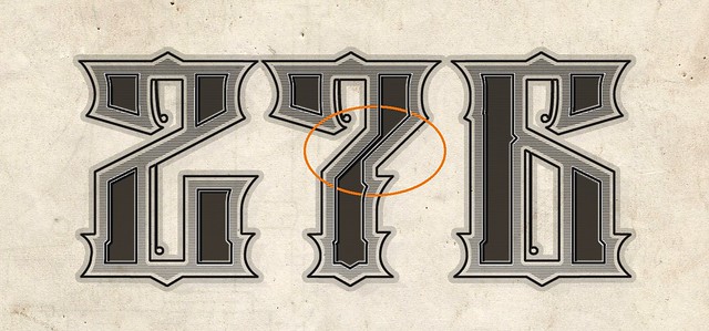
I was just looking at it and was thinking it looked a little strange too.. is it the area in the sircle you are meaning is wrong? It should probably follow the lines at the 2 if I understand you correctly?
The area with the circle should have a horizontal bar to match the other two 7's in the piece or the other two 7's should be changed to having no bar.
The number "2" and number "6" might look better if there curves were mirror images, if that makes sense.
Hmm.. I´m not quite sure what you mean about "a horizontal bar", but it´s probably me, struggling a bit with english terms.. as Norwegian is my main language But I´ll try to figure it out. Really appreciate the feedback tho!
When I made the "6", I copied the "2" and just flipped it horizontally and made it into a 6.. except the litle detail strokes.
If I understood you correctly this time, it´ll be a little more like this? Not sure I´ll keep it exactly like this, but did a quick change to see if I understood
The changes you've made to the seven make it look less like a 7. What about removing the spur. Something like this.
276.jpg (49.79 KiB) Viewed 19479 times
To me it has more balance... and retains the 7 look.
Tim
Sure I paint thing for my amusement and then offer them for sale. A brushslinger could whither en die from lack of creativity in this plastic town my horse threw a shoe in.
Thanks for the feedback! I´ll do some testing when more of the "Sanborn" project is illustrated to see the over all look of the piece..The horizontal line I did in the previous 7 was maybe a little much, but just wanted to see if I understood it right Not sure I´ll keep it exactly like that. When all this is done, it would have been cool to try to make it into a font too.. a good friend got the Fontographer and we just put in the numbers to test.
Marius,
You are a lucky man. The guys really helped you with this one and it is even beter then it was originally.
This back and forth sliding with a design is how we can learn the best to see what works or not.
Defiantly and I´m very grateful for the help, tips and suggestions I get to improve my skills and work.. So far I´m still liking the "7" with the horizontal line over it, but not yet finished with the final design so I really appreciate all the feedback to see what works better


 Denver Chapter of the Letterheads