Welcome to The Hand Lettering Forum! This is an interactive Bulletin Board on the topics of Sign making, design, fabrication, History, old Books and of coarse Letterheads, Keepers of the craft. The Hand Lettering Forum features links to resources, sign art history, techniques, and artists profiles. Learn more about Letterheads at https://theletterheads.com. Below you'll see Mchat has been added as a live communication portal for trial, and the Main forum Links are listed below.
Merry Christmas you guy's! Just going to have some Christmas turkey so I'll make this quick.
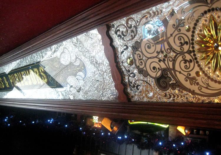
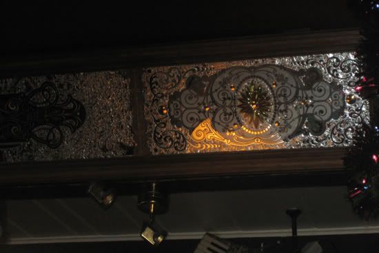
I ment to show you these finished signs a few weeks back ,they were installed about a week ago ,one is 160 inches long and the other 120''s.
These were originally outside the pub. I made them about 10 years ago, they just had a simple one colour shade to the letters the first time I made them.
This time the scrolls were changed on the ends to a more caligraphic scroll and I brush blended the shades on the letters to make the signs look a little more interesting I also as you can see added some drop shadows to give it a feeling of jumping off. I was a little bit tight for space , so some of these angles to the shades look a bit odd but it adds a little character to the signs. The end panels were seperate and matched the previous mirrors I made for the walls.
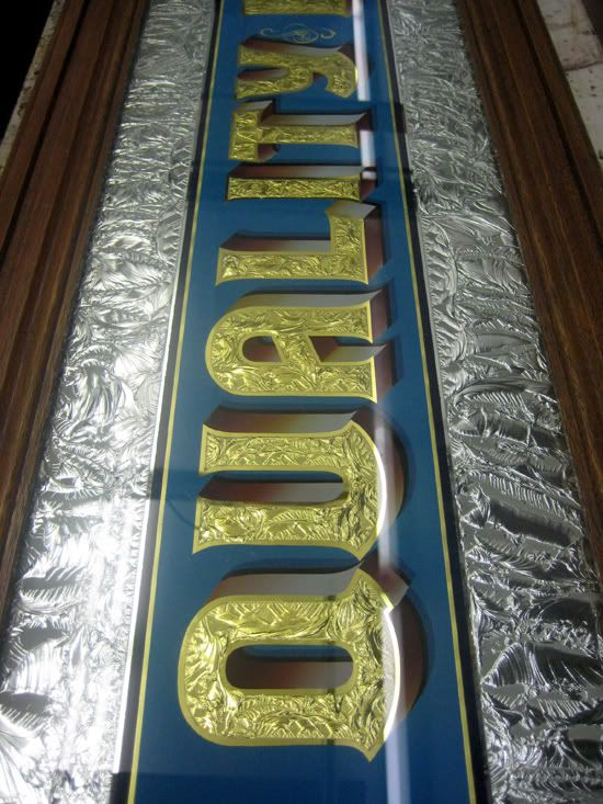
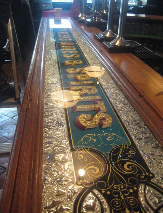
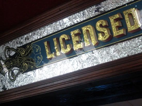
Instead of striping all the mirrors next time on a job like this it would be probably easier to start with fresh glass and also you would have a chance to re-design things 10 years on. They read (Licensed Victuallers and Purveyors of Quality Beers Fine Wines and Spirits ) They look nice in the pub and the landlord was happy they were installed in time for the Christmas break.
Have a good Christmas! don't eat too much!
Dave
Thanks! Pat and Wayne, a pint sure does sound good. Larry If you could see what I am about to wear for a fancy dress party for Saturday night I think you would probably think I am a queen as apposed a king. There are so many of us doing work like this that I rate as Kings and look up to them including you ,so thanks for that. I sometimes think I post my work to often but this is a website where we all learn and share what we do like yourself. It's nice to share it with like minded people,some of the people who drink in the pubs don't appreciate reverse glass and they never will but there are allot that do understand it. As for fitting these type of signs I would call a friend and I would help as best I could. I hate fitting! Well did you guy's have a good Christmas? I'm full of chocolate right now.
Been dragged around all the clothes sales by my girls today, I hate shopping too! I was wondering if it had stopped snowing at Bernhardt house, he's probably trapped. anyone know?
Dave
Dave, never think you post too much of your work here. I assure you there are many like myself that anxiously open every post you make, hoping to see more of your awesome work and read whatever information you have to share.......so thank you,......keep it coming...and have a great new year !
Dave....a real sweet one there....but did you add the brilliant cut sections now?....or did you cut them back then? And also which/who's pub is this for?
Doug.I made these cut pieces about a month ago to match in with some wall cutting panels,these long chipped signs were once on the outside of the pub called the Clocktower.
The owner decided to have some electric canvas blinds installed for the smokers, he had the glass signs taken down and placed in frames and re-fitted inside the pub. I extended them to fit the full width of the side parts to the bar with cut panels either side.
Dave
Thanks Kelly. I have a restoration piece on at the moment (Turkish Cigarettes) I wish I had never taken it on, real learning curve to this one. It's a real boring piece and very time consuming lots of flaking going on, I told the customer I would be better off completely striping the glass as it's just not worth doing it . Nearly finished my Morris Minor Van, I will post a few pics of the glass signs inside it once I'm done.
Dave
Hey Dave... could you give a brief explanation of the steps you employed to execute these letters?
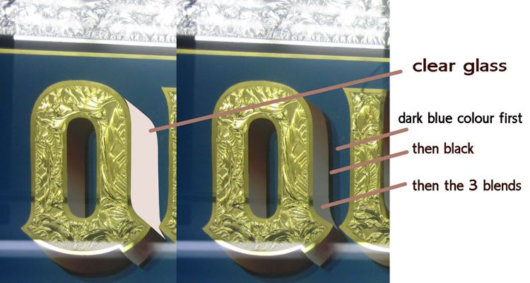
As I see it, glue chipped and gilded, that's pretty straight forward. Then there's a blended shade of maroon into light gray (?), followed by a shade of black, then a shade of dark blue, against the lighter blue background.
I guess my question would be; How did you execute the blended shade, I would've employed an outline around the letter (and the shade) enclosing the area to do the blend. But you did not. How did you do it?
Hi Larry.
Yes, chipped and glass gilded then hand painted on the back of the gold allowing for a glowline - cleaned off the excess gold, then marked the front of the glass where my shades were going to be with a pen paint marker .I painted in the entire blue background leaving an area of clear glass as the shadow ,once the blue was dry I put the next blue shade in (darker) then the black and finally blend in the 3 colours.
Hope this helps mate.
Dave
Larry as you know you can also do it the other way of painting in your black line first and then the darker blue line and then blend your shades leaving the background to be painted last.
By doing it this way you could also distress the background all over the back of the text without worrying abput clear shade areas.
Dave
Hello Robert.
The blends are painted with a brush. I feel if an airbrush is used it looks wrong.
It seems to look more authentic hand blended, I was taught to hand blend while doing my apprentiship - it's the way the old guy's used to make these signs.
Airbrushing gives a nice transition for backgrounds but for lettering I prefer to hand blend Robert.
Dave
I agree with Dave, the blending looks best when done with a brush and you can work it on glass until it looks good. Besides, the final appearance is more traditional which is best for restoration or reproduction. For those who have not done this type of blend before, you can place a mirror so that you can watch your progress as you work the color to the right blend.
Another thought, some color backgrounds tend to be somewhat transparent or translucent. In order to do the background first, it is wise to opaque it before doing the next steps including blending. Over paint may not show much initially but can burn through in UV. The easiest way to do so is to dust the background once it arrives at a tack, with aluminum powder. If you blend the background and it is not even enough to dry to a good tack to dust, let it dry and do a quick coat of clear fast size, then dust at its tack. We also used to use lampblack and other dark color powders as well as bronze powder. An additional coat of color or black will sometimes opaque the color, sometimes not, that is why dusting works best and is quick and easy to do.

 Denver Chapter of the Letterheads