Chuck Davis asked me to design him a website front page for Letterhead Studios a new site he is in the process of putting together.
I finished up this front page design for him today and thought it would be good to show you guy's here. The text for different areas on the ribbons and panels will be added by Letterhead Studios and Letterhead Fonts once they have the files .
It took about 170 hours to design and put together with just about 430 layers in photoshop ,all I can say is thank god for auto select...
Dave
Welcome to The Hand Lettering Forum!
This is an interactive Bulletin Board on the topics of Sign making, design, fabrication, History, old Books and of coarse Letterheads, Keepers of the craft. The Hand Lettering Forum features links to resources, sign art history, techniques, and artists profiles. Learn more about Letterheads at https://theletterheads.com. Below you'll see Mchat has been added as a live communication portal for trial, and the Main forum Links are listed below.
This is an interactive Bulletin Board on the topics of Sign making, design, fabrication, History, old Books and of coarse Letterheads, Keepers of the craft. The Hand Lettering Forum features links to resources, sign art history, techniques, and artists profiles. Learn more about Letterheads at https://theletterheads.com. Below you'll see Mchat has been added as a live communication portal for trial, and the Main forum Links are listed below.
Letterhead Studios Design
Moderators: Ron Percell, Mike Jackson, Danny Baronian
-
DAVE SMITH
- Posts: 1213
- Joined: Sat Jul 10, 2004 11:12 am
- Location: ENGLAND
Letterhead Studios Design
- Attachments
-
- letterhead studios 3.jpg (181.12 KiB) Viewed 38370 times
-
- letterhead studios 2.jpg (175.1 KiB) Viewed 38329 times
-
- letterhead studios 1.jpg (102.5 KiB) Viewed 38294 times
Last edited by DAVE SMITH on Tue May 05, 2009 3:50 pm, edited 1 time in total.
-
DAVE SMITH
- Posts: 1213
- Joined: Sat Jul 10, 2004 11:12 am
- Location: ENGLAND
Re: Letterhead Studios Design
other parts
- Attachments
-
- letterhead studios 5.jpg (78.31 KiB) Viewed 38231 times
-
- letterhead studios 4.jpg (175.4 KiB) Viewed 38229 times
-
DAVE SMITH
- Posts: 1213
- Joined: Sat Jul 10, 2004 11:12 am
- Location: ENGLAND
Re: Letterhead Studios Design
I had the fire blowing to the right but they prefered it going straight up in the finished design.
- Attachments
-
- letterhead studios 6.jpg (142.85 KiB) Viewed 38196 times
-
Mark Summers
- Posts: 177
- Joined: Mon Feb 02, 2009 4:03 pm
- Location: Frisco, Co
- Contact:
Re: Letterhead Studios Design
How big was the file when you were done? How did Photoshop handle 430 layers?
A+ work....again, Dave.
Mark
A+ work....again, Dave.
Mark
-
Wayne Osborne
- Posts: 165
- Joined: Tue Jun 15, 2004 2:03 am
- Location: West Sussex.England
Re: Letterhead Studios Design
-
Larry White
- Posts: 1213
- Joined: Thu Apr 08, 2004 4:18 am
Re: Letterhead Studios Design
.
Last edited by Larry White on Wed Mar 16, 2011 10:08 am, edited 1 time in total.
-
Jerry Berg
- Posts: 369
- Joined: Wed May 02, 2007 3:17 pm
- Location: pacific northwest
Re: Letterhead Studios Design
That's a lot to take in there Dave. Wow! I'm outa words with your stuff.
Thanks for the preview, I'll more than enjoy looking at this for quite some time.
Hmmm... Beautiful!
Thanks for the preview, I'll more than enjoy looking at this for quite some time.
Hmmm... Beautiful!
Re: Letterhead Studios Design
All I can say is WOW. That's some fancy footwork goin' on. I mean, you didn't do that with just your fingers, did ya?
-
vance galliher
- Posts: 321
- Joined: Mon Apr 12, 2004 11:38 pm
- Location: springfield, or.
- Contact:
Re: Letterhead Studios Design
.....does all this design stuff come to you in dreams Mr.Smith ? My lord......it's just incredible what you do !! You're so prolific ! Thanks for sharing your world Dave.
Re: Letterhead Studios Design
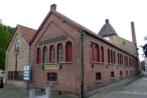
Myself, I'd like to know a little bit about the three-story building depicted in the vignette. I thought at first that it was the Grand Union Hotel in Fort Benton, MT, http://www.grandunionhotel.com/about-gr ... -hotel.htm but I think that was just because of the way the building is pictured.
-
DAVE SMITH
- Posts: 1213
- Joined: Sat Jul 10, 2004 11:12 am
- Location: ENGLAND
Re: Letterhead Studios Design
Thanks everyone for your comments. Photoshop was a little sluggish at first but when I changed my computer half way through this design I had the problem solved.
The size of the total file was 7000pixels wide at 300dpi = 470meg .all the design was hand sketched and scanned back and fourth to get the hand look we achieve with signwriting like before with the Letterhead Fonts page.
Dave .I was hunting around for a factory scene for this design but could not find one in colour,it also needed to be a corner building as I had already made the flag in the centre at the top and was basing it around that. I found some black and white designs but they would have needed re-drawing and colouring which would have taken many more hours. I found this little studio house in a book but it was not a good copy and was small so I spent some time building all the colour back into it and re doing the backgrounds and line work ,most of the picture work for the house was done using Corels Painter programme on a wacom tablet. If any of you guy's have a nice brewery/chimney scene but it must be a corner building and in colour please could you forward it to me as I still would like to change this part. Chuck is happy with it but I still think a chimney industrial look with red stone buildings would look better.
Thanks again and glad you like it. It's nice to get feed back from you guy's here. Its easy to get yourself so far into a design and find you are going in the wrong direction. This design was made over 3 to 4 months in between blasting and gilding glass and other types of work.
Thanks .
Dave
Re: Letterhead Studios Design
Dave,
Here's one from Budweiser... http://www.cnbc.com/id/25479137/?slide=3 With all your skills you ought to be able to grab it, clip it and insert. You might even be able to get a higher res scan from them if you explain you're only using the building.
Here's one from Budweiser... http://www.cnbc.com/id/25479137/?slide=3 With all your skills you ought to be able to grab it, clip it and insert. You might even be able to get a higher res scan from them if you explain you're only using the building.
-
Kelly Thorson
- Posts: 502
- Joined: Tue Apr 20, 2004 11:53 pm
- Location: Penzance, SK Canada
- Contact:
Re: Letterhead Studios Design
That's incredibly stunning Dave! 170 hours - wow, at my rates that job would price out at over $10,000! Only I'd take twice as long and do half the job.  I hope Chuck realizes your worth!!!!
One small critique if you don't mind. The flames just seem out of keeping with the rest of the image. They seem too realistic to fit the rest of the image and so when you look at the whole they seem to take precidence. If they were made more stylized I think they would suit the overall image better. I'd also slightly tone down the colour or else brighten up the dragons a tiny bit (preferrably -that would give a bit more depth to the entire image) to put them on the same plane.
I realize that monitors play a large part in how an image appears, I may go to my shop monitor and change my mind about my comments here.
In any case it is beautiful work. Congrats! Your talents run deep.
I believe there is no shame in failure. Rather, the shame lies in the loss of all the things that might have been, but for the fear of failure.
-
Tony Segale
- Posts: 702
- Joined: Thu Apr 08, 2004 10:20 am
Re: Letterhead Studios Design
why do I have to be a victim of all these flourishes and details that you like?
you know nuthing about designing simple, nothing.
you design each piece, layer by layer, you know nothing.
now, all my design skills are gone.
you don't understand, my mind doesn't work anymore.
you know nuthing about designing simple, nothing.
you design each piece, layer by layer, you know nothing.
now, all my design skills are gone.
you don't understand, my mind doesn't work anymore.
and he took that golden hair and made a sweater for baby bear.
http://www.tonysegale.com
http://www.tonysegale.wordpress.com
http://www.tonysegale.com
http://www.tonysegale.wordpress.com
-
DAVE SMITH
- Posts: 1213
- Joined: Sat Jul 10, 2004 11:12 am
- Location: ENGLAND
Re: Letterhead Studios Design
Thanks Tony boy. and Kelly. Kelly, I like critics because I learn more from other peoples views so not a problem one bit. The flames will be smaller once viewed and this was discussed between Chuck and myself about realism to the rest of the design,Chuck said exactly the same as you on the larger flame work but you know I actually liked the different look as it did stand out more. The border was a lott darker to this image and the centre design popped out slightly more but Chuck asked for it to be lighter to show off the detail in the surrounding border work. He will probably make it work once he gets the raw files in his own hands.
It's always a learning curve with these designs as some colours work better with others I'm for ever changing this type of work as I go along. As for working for Chuck ,he's probably one of the best customers around for this type of work. He pays me as I go and always pays the best price for design work. and he appreciates it which is always a bonus...
Dave
-
DAVE SMITH
- Posts: 1213
- Joined: Sat Jul 10, 2004 11:12 am
- Location: ENGLAND
Re: Letterhead Studios Design
Dave thanks for the link but it probably will be too long for the oval shape and it would not marry up with the top flag area, but hey thanks anyway for your link.
Dave
Dave
-
Kelly Thorson
- Posts: 502
- Joined: Tue Apr 20, 2004 11:53 pm
- Location: Penzance, SK Canada
- Contact:
Re: Letterhead Studios Design
Well hopefully I'm not too much of a critic. 
I only mentioned it because I know how working for long periods of time on a project make it difficult to see the small nuances and 170 hours is a very long time!
It's funny how our minds can over rule our eyes. In some ways our minds are a lot like computers, only without a refresh key, so sometimes that cached image is what we are seeing in lieu of what is really there. Little tricks like turning your work upside down, viewing it in a mirror, convering to grayscale all help give a different outlook. I don't know if you struggle with that at all, some people don't seem to have a problem with it, but it's probably my biggest obstacle as an artist.
It's always great to hear someone is being treated right by a client!
I believe there is no shame in failure. Rather, the shame lies in the loss of all the things that might have been, but for the fear of failure.
Re: Letterhead Studios Design
Okay. Now I can be just a little critical... I think you should include more of the blue field on the flag. There just seems to be not enough of the blue field and white stars and more red and white stripes than it would if it were a 'real' flag. Just my two cents now that I've spent so much time looking at it.
-
Henry Contreras
- Posts: 38
- Joined: Sat Apr 04, 2009 12:14 pm
Re: Letterhead Studios Design
This is truley amazing. You are a true master of your craft
-loco
-loco
-
DAVE SMITH
- Posts: 1213
- Joined: Sat Jul 10, 2004 11:12 am
- Location: ENGLAND
-
Larry White
- Posts: 1213
- Joined: Thu Apr 08, 2004 4:18 am
Re: Letterhead Studios Design
.
Last edited by Larry White on Wed Mar 16, 2011 10:09 am, edited 1 time in total.
-
DAVE SMITH
- Posts: 1213
- Joined: Sat Jul 10, 2004 11:12 am
- Location: ENGLAND
Re: Letterhead Studios Design
Larry . good effort thanks. I really would like colour if I were to change the building. It would save alott of time.these are very good though and would work with this design. Maybe the next one what ever that will be. I am moving onto creating my own page soon so maybe one there might work when I get time.
Thanks matey Aho!
Dave
Thanks matey Aho!
Dave
-
Tony Segale
- Posts: 702
- Joined: Thu Apr 08, 2004 10:20 am
Re: Letterhead Studios Design
just might make some sense to start over.
and he took that golden hair and made a sweater for baby bear.
http://www.tonysegale.com
http://www.tonysegale.wordpress.com
http://www.tonysegale.com
http://www.tonysegale.wordpress.com
-
Doug Bernhardt
- Posts: 1077
- Joined: Fri Apr 09, 2004 9:29 am
- Location: Ottawa Canada
- Contact:
Re: Letterhead Studios Design
Davey....Brilliant work and as mentioned to you I wouldn't change a thing. It would be easy to putz around with this for another week and not be any further ahead. I personally love the flames in this as I did the flowers in the last piece. It might be the sign of design things yet to come. One of the great joys in this is the use of colour. That blue next to brown......would never have thought of those combinations and would love to hear of any reference material you use for the choices.
-
Henry Contreras
- Posts: 38
- Joined: Sat Apr 04, 2009 12:14 pm
Re: Letterhead Studios Design
Dave do you have any sketches of your work. I really like see the rough sketches and how or what goes on in a person head. The behind the scenes process.
Here's a link to a poster I screen printed for an artist. He did the artwork and I screen printed it for him
http://www.gigposters.com/forums/screen ... ocess.html
-loco
Here's a link to a poster I screen printed for an artist. He did the artwork and I screen printed it for him
http://www.gigposters.com/forums/screen ... ocess.html
-loco
-
erik winkler
- Posts: 1097
- Joined: Sat Feb 23, 2008 5:48 pm
- Location: Amsterdam Netherlands
- Contact:
Re: Letterhead Studios Design
Dave,
I took some time to look up some more.
If there is none to your liking, maybe just cut the chimney and paste it behind a better photo of a regular factory.
http://www.tov.be/uploadedImages/_produ ... helrei.jpg
http://www.lindemans.be/download/item/23/nl/ 4 different interior pictures...
http://home.scarlet.be/~tsc30326/media/ ... Mena01.jpg
http://www.abdijpostel.be/Copy_of_brouwerij.jpg
http://www.josenclim.nl/Litouwen/images ... uwerij.jpg
http://nieuwsblad.typepad.com/zottegem/ ... _large.jpg
http://www.architectdugardyn.be/cms_fil ... -Photo.jpg
http://upload.wikimedia.org/wikipedia/c ... rre800.jpg
http://users.belgacombusiness.net/decen ... ij-VGA.jpg
http://upload.wikimedia.org/wikipedia/c ... %C3%AB.jpg
http://farm1.static.flickr.com/59/15362 ... 31.jpg?v=0
and some German ones:
http://www.steinburg-schule.de/Bilder%2006/Brauerei.JPG
http://www.westallgaeu.de/se_data/_file ... r/1-20.JPG
http://image44.webshots.com/45/3/85/46/ ... zac_fs.jpg
Last edited by erik winkler on Sun May 10, 2009 2:09 am, edited 1 time in total.
Realizing we are in the 2nd renaissance of the arts.
Learn, copy and trying to improve...
Still in the learning phase
Amsterdam Netherlands
www.ferrywinkler.nl
www.schitterend.eu
www.facebook.com/Schitterend.eu
Learn, copy and trying to improve...
Still in the learning phase
Amsterdam Netherlands
www.ferrywinkler.nl
www.schitterend.eu
www.facebook.com/Schitterend.eu
-
brian oliver
- Posts: 10
- Joined: Tue Jan 31, 2006 12:03 pm
- Location: Ft. Collins, CO
- Contact:
Re: Letterhead Studios Design
That's not just beautiful, it's PERFECT.
However, I'd just change one thing. Can you change the griffins to lions?
And maybe instead of a torch, they're holding a quill? Or maybe a chisel? Can you do both?
And maybe the lettering can be something more, I don't know, readable? How about Brush Script.
Oh and the building...can you change it to a boat? How about a horse? I have a niece who draws horses real good. Could you use one of hers?
Other than those small changes, it's PERFECT.
Oh, one more thing, can you make it, like, blue letters on a red background? Those are my favorite colors.
Aaaaaaaaand, let's see. No, I think that's it.
Seriously, Dave, it's gorgeous. Make that seriously gorgeous.
(I guess the KISS principle isn't one you follow too much.)
-
DAVE SMITH
- Posts: 1213
- Joined: Sat Jul 10, 2004 11:12 am
- Location: ENGLAND
Re: Letterhead Studios Design
Brian. I will make those changes just for you mate. Give me about an hour, oh and a kiss is just fine. I will scan some of the pencil sketches when I get time and post them for you Henry.
Thanks
Dave
Thanks
Dave
Re: Letterhead Studios Design
That is totally amazing.
I hope one day I have 1/100th of the skill you have when it comes to this stuff.
I hope one day I have 1/100th of the skill you have when it comes to this stuff.
Dan Beach
Cylinder 9 Designs
South Jersey
Cylinder 9 Designs
South Jersey
-
DAVE SMITH
- Posts: 1213
- Joined: Sat Jul 10, 2004 11:12 am
- Location: ENGLAND
 Denver Chapter of the Letterheads