Welcome to The Hand Lettering Forum! This is an interactive Bulletin Board on the topics of Sign making, design, fabrication, History, old Books and of coarse Letterheads, Keepers of the craft. The Hand Lettering Forum features links to resources, sign art history, techniques, and artists profiles. Learn more about Letterheads at https://theletterheads.com. Below you'll see Mchat has been added as a live communication portal for trial, and the Main forum Links are listed below.
Hope you're not getting tired of this "sales piece" stuff. Here's one, more to come.
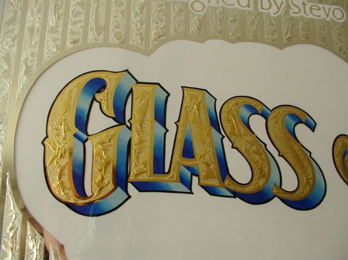
This is for a friend, He designed it. He's a designer in Canada. I changed things slightly.
I blended the shadow using 2 colors. Larry's tutorial he posted says use 3 colors, but I'm
juggling numerous pieces and got to get things done! Do you think it looks allright with two,
and does three colors make a BIG difference?
There's more to be done on this, I'll post the finished piece.
Jerry
[/img]
[/img]
Last edited by Jerry Berg on Wed Apr 22, 2009 1:36 pm, edited 1 time in total.
Well, I got 'er finished. Colors really can make or break a piece (so can dropping it)... I hope the colors
worked on this one. I did'nt want the scrolls competing with the main copy and when I put different test
colors behind it thats what was happening. The smaller copy has a gradiant blue background that can't
really be seen in the pictures. What'ya think? What might you have done?
This is very nicely made Jerry. The colours ,layout and execution are spot on.
I like the fade also to the background. As Doug B would always say to me you now need to make another one.
Nice job mate
Dave
Thanks Dave. I never really know what something really looks like after it's done. If I don't look at it for quite a while then I can see it for what it is. There are allways so many choices ya know. I chipped two of these so when I can get to it I'll do one for me.
Anyway, thanks again for the nice words.
 [/img]
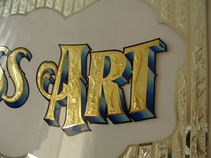 [/img]
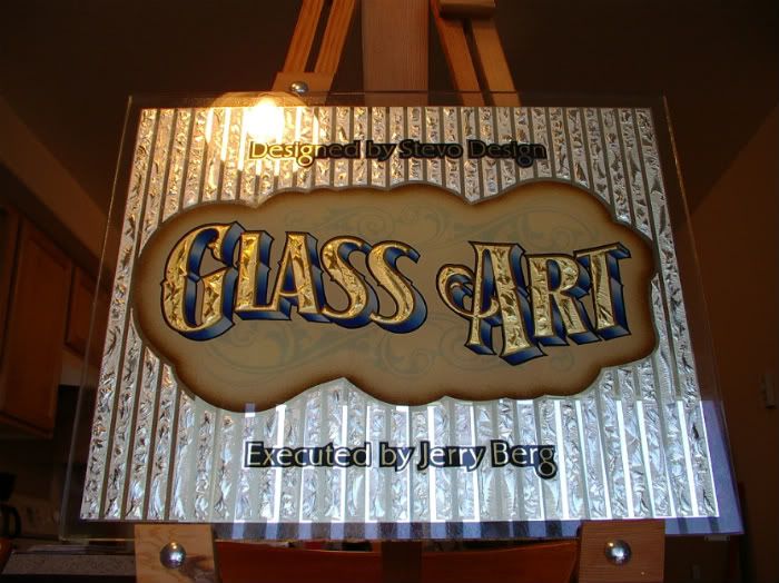 [/img]
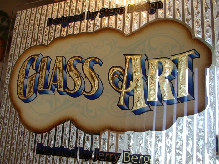 [/img]
 Denver Chapter of the Letterheads